반응형
<최종 화면> 자바 스크립트를 사용하지 않음. 기능은 따로 없음
flex를 이용하여 배치하고, 반응형 웹을 이용하여 크기가 작아졌을 시 모바일 전용 화면 구현하는 예제이다.

우선 최종 화면의 위에서 부터 아래로 차근차근 비슷한 모양으로 작성해보자.


두 번째 영역을 만들자. (주황색 네모 부분)


메뉴 처럼 보이는 navigation bar를 만들자.


그 밑에 보이는 글씨들을 써보자. 콘텐츠 영역을 왼쪽, 나머지 부분으로 나눌것이다.


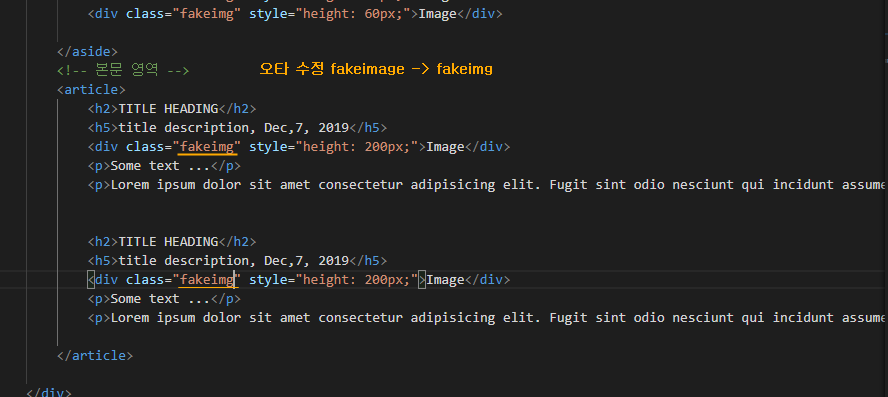
왼쪽 사이드 내용 외의 내용은 본문 영역에 작성하자.


이제 두 번째 네모에 주황색 배경 및 배치(스타일)를 적용해보자.


navigation bar의 배경색과 그안의 메뉴 글씨를 정렬하자.


마우스 커서를 올렸을때, 색을 변경하여 효과를 주겠다. (hover 이용)


footer영역은 따로 빼주겠다. 본문 영역과 구분되어야 하므로


왼쪽 사이드 영역과 본문 영역의 브라우저 화면을 차지하는 비율을 주겠다.


사이드 영역과 본문 영역에 배경색 및 padding을 주자.


이미지는 없지만 이미지가 들어갈 부분의 크기와 배경색을 주겠다.


footer영역에도 스타일을 적용하자.


이제 모바일(작은 화면)에서 열었을 시, 잘 보이도록 media로 반응형 웹을 적용하자.

<복붙용 코드>
|
1
2
3
4
5
6
7
8
9
10
11
12
13
14
15
16
17
18
19
20
21
22
23
24
25
26
27
28
29
30
31
32
33
34
35
36
37
38
39
40
41
42
43
44
45
46
47
48
49
50
51
52
53
54
55
56
57
58
59
60
61
62
63
64
65
66
67
68
69
70
71
72
73
74
75
76
77
78
79
80
81
82
83
84
85
86
87
88
89
90
91
92
93
94
95
96
97
98
99
100
101
102
103
104
105
106
107
108
109
110
111
112
113
114
115
116
117
118
119
120
121
122
123
124
125
126
127
128
129
130
131
132
133
134
135
136
137
138
|
<!DOCTYPE html>
<html>
<head>
<meta charset="UTF-8">
<title>Tamplate Web Site</title>
<style>
body{margin: 0;}
/* header 영역 */
header{
height: 200px;
background-color: tomato;
display: flex;
flex-direction: column; /*수직 배치*/
align-items: center;
justify-content: center;
color: white;
}
/* navigation bar */
nav{
display: flex;
background-color: #333333;
}
nav a{
color: white;
padding: 14px 20px;
text-decoration: none;
text-align: center;
}
nav a:hover{
background-color: #dddddd;
color: black;
}
#container{
display: flex;
flex-wrap: wrap;
}
/* 왼쪽 사이드 */
aside{
flex-grow: 3;
background-color: #f1f1f1;
padding: 20px;
}
article{
flex: 7;
background-color: white;
padding: 20px;
}
.fakeimg{
background: #aaaaaa;
width: 100%;
padding: 20px;
}
footer{
padding: 20px;
text-align: center;
background: gray;
}
/* 반응형 웹 */
@media all and (max-width: 600px){
#container, nav{
flex-direction: column;
}
}
</style>
</head>
<body>
<!-- notice 영역 -->
<div style="background-color: yellow; padding: 5px;">
<h4 style="text-align: center;">notice region</h4>
</div>
<!-- header 영역 -->
<header>
<h1>My Website</h1>
<p>With a <strong>flexible</strong> layout.</p>
</header>
<!-- navigation bar -->
<nav>
<a href="#">Link</a>
<a href="#">Link</a>
<a href="#">Link</a>
<a href="#">Link</a>
</nav>
<!-- 콘텐츠 영역 -->
<div id="container">
<!-- 왼쪽 사이드 -->
<aside>
<h2>About Me</h2>
<h5>Photo of me:</h5>
<div class="fakeimg" style="height: 200px;">Image</div>
<p>Some text about me</p>
<h3>More Text</h3>
<p>This is text region</p>
<div class="fakeimg" style="height: 60px;">Image</div>
<div class="fakeimg" style="height: 60px;">Image</div>
<div class="fakeimg" style="height: 60px;">Image</div>
</aside>
<!-- 본문 영역 -->
<article>
<h2>TITLE HEADING</h2>
<h5>title description, Dec,7, 2019</h5>
<div class="fakeimg" style="height: 200px;">Image</div>
<p>Some text ...</p>
<p>Lorem ipsum dolor sit amet consectetur adipisicing elit. Fugit sint odio nesciunt qui incidunt assumenda similique, quisquam amet dolor esse explicabo quam voluptatibus velit odit error cumque cum rem aspernatur!</p>
</article>
</div>
<!-- footer -->
<footer>
<h2>Footer</h2>
</footer>
</body>
</html>
|
반응형
'안드로이드 웹앱 콘테츠 개발자 양성(국비지원) > HTML+ CSS' 카테고리의 다른 글
| HTML+CSS (기초) flex 스타일 적용하기 1-2 (0) | 2019.12.10 |
|---|---|
| HTML+CSS (기초) flex 스타일 적용하기 1-1 (0) | 2019.12.10 |
| HTML+CSS (기초) 부모 요소, 자식 요소 사이즈 영향 (0) | 2019.12.10 |
| HTML+CSS (기초) 홈페이지 만들기 스타일 시트 적용 (media 이용, 기능 없음) (2) | 2019.12.10 |
| HTML+CSS (기초) media 스타일 적용하기 2 (브라우저 크기에 따라 사이즈 조절) (0) | 2019.12.10 |


댓글