반응형
버튼의 모양을 다르게 만들기 위해서는 추가 작업이 필요하다.
또한 버튼에 이미지를 넣고 그 이미지의 크기를 제어하자.
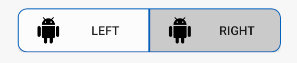
<최종 화면>

우선 xml 작업을 하자.
android:drawableLeft, android:background는 에러 표시가 날 것이다.
(현재는 없기 때문에, 밑에서 만드는 작업을 할 것이다.)
activity_main.xml
|
1
2
3
4
5
6
7
8
9
10
11
12
13
14
15
16
17
18
19
20
21
22
23
24
25
26
27
28
29
30
31
32
33
|
<?xml version="1.0" encoding="utf-8"?>
<androidx.constraintlayout.widget.ConstraintLayout xmlns:android="http://schemas.android.com/apk/res/android"
xmlns:app="http://schemas.android.com/apk/res-auto"
xmlns:tools="http://schemas.android.com/tools"
android:layout_width="match_parent"
android:layout_height="match_parent"
tools:context=".MainActivity">
<LinearLayout
android:layout_width="wrap_content"
android:layout_height="wrap_content"
android:orientation="horizontal"
app:layout_constraintBottom_toBottomOf="parent"
app:layout_constraintEnd_toEndOf="parent"
app:layout_constraintStart_toStartOf="parent"
app:layout_constraintTop_toTopOf="parent"
app:layout_constraintVertical_bias="0.784">
<Button
android:layout_width="150dp"
android:layout_height="50dp"
android:text="left"
android:drawableLeft="@drawable/icon"
android:paddingLeft="20dp"
android:background="@drawable/left_btn_backgound"/>
<Button
android:layout_width="150dp"
android:layout_height="50dp"
android:text="right"
android:drawableLeft="@drawable/icon"
android:paddingLeft="20dp"
android:background="@drawable/right_btn_backgound"/>
</LinearLayout>
|
이제 버튼에 들어갈 android:background(배경)와 android:drawableLeft(이미지)에 들어갈 아이콘을 만들것이다.
<배경 만들기>
res->drawable (마우스 우클릭) -> new -> Drawable Resource File

파일 이름을 임의로 정하고, Root element를 shape로 해주자.

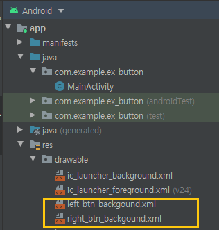
left_btn_backgound.xml
|
1
2
3
4
5
6
7
8
9
10
11
12
13
|
<?xml version="1.0" encoding="utf-8"?>
<solid
android:color="#FFFFFF"/>
<stroke
android:width="1dp"
android:color="#0A64BE" />
<size
android:width="200dp"
android:height="36dp" />
<corners android:bottomLeftRadius="10dp"
android:topLeftRadius="10dp"/>
</shape>
|

같은 방법으로 오른쪽 버튼의 배경도 만들자.
Right_btn_backgound.xml
|
1
2
3
4
5
6
7
8
9
10
11
12
13
|
<?xml version="1.0" encoding="utf-8"?>
<solid
android:color="#CCCCCC"/>
<stroke
android:width="1dp"
android:color="#0A64BE" />
<size
android:width="200dp"
android:height="36dp" />
<corners android:bottomRightRadius="10dp"
android:topRightRadius="10dp"/>
</shape>
|

<이미지 만들기>
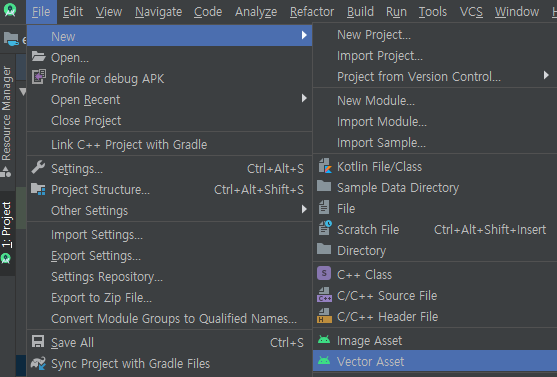
File -> New -> Vector Asset을 들어가자.
(만약 이미지 파일이 있다면 아래 작업을 넘어가도 된다. 이미지 파일을 drawable에 추가.)
임의로 아무 이미지를 선택해서 추가했다.


res->drawable (마우스 우클릭) -> new -> Drawable Resource File
파일 이름을 임의로 정하고, Root element를 layer-list로 해주자.
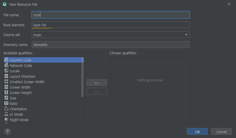
icon.xml
|
1
2
3
4
5
6
7
|
<?xml version="1.0" encoding="utf-8"?>
<item
android:drawable="@drawable/ic_android_black_24dp"
android:width="30dp"
android:height="30dp"/>
</layer-list>
|
이렇게 해주면 이미지의 크기도 변경이 가능하며 버튼에 text도 쓸 수 있다.
반응형
'안드로이드 > 개발자 일상' 카테고리의 다른 글
| 안드로이드 Gson 라이브러리 (JSON 파일을 만들어서 Gson 이용) (0) | 2020.03.19 |
|---|---|
| 안드로이드 앱 권한 요청 라이브러리 AutoPermissions (2) | 2020.03.17 |
| 안드로이드 SharedPreferences 값 저장하고, 불러오기. (3) | 2020.03.12 |
| 안드로이드 xmlns:tools , tools: (0) | 2020.03.12 |
| 코드 작성 시 다양한 표기 방법 (카멜, 파스칼, 헝가리안, 스네이크) (1) | 2020.03.11 |


댓글